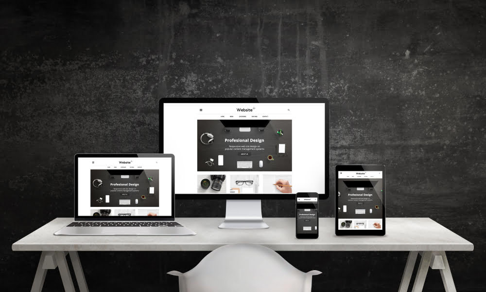
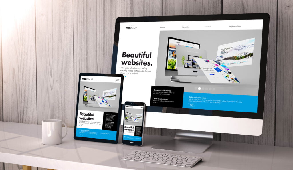
In today’s digital era, it is crucial that your website adapts to different devices and screen sizes. Responsive web design is the perfect solution for this challenge. This web design technique ensures that your page is correctly visible and functional on any device, whether it’s a desktop computer, tablet, or mobile phone.
Responsive web design is based on creating an interface that automatically adjusts and adapts to the screen size and resolution of each device. This involves using specific technologies and techniques that allow page elements such as text, images, and buttons to rearrange and resize fluidly.
Why is responsive web design important in marketing?
Responsive web design is not only crucial from a design and usability perspective, but it also has a significant impact on your business’s marketing efforts. Here are some key benefits that demonstrate the importance of responsive web design:
- Improves your search engine rankings: Google values responsive design and favors pages that adapt to mobile devices. By having a responsive website, you have a higher chance of achieving better rankings in search engine results, which means increased visibility and more opportunities to attract potential customers.
- Increases user retention: Visitors expect a smooth and fast experience on your site. If your page doesn’t load properly on their devices, they are likely to leave and seek another option. Responsive design ensures smooth navigation and keeps users engaged for longer. This translates to higher user retention and increased chances of converting them into customers.
- Builds trust and enhances the consumer experience: A website that looks and functions well on all devices conveys professionalism and trustworthiness. Users value a positive experience and are more likely to return and recommend your brand. By providing a consistent and quality experience across devices, you are creating a positive impression on your users and establishing a trusted relationship with them.
Key Elements in Responsive Web Design
When creating a responsive web design, it’s important to consider the following elements to ensure an optimal user experience:
Adaptable typography: Adjust the font size based on the device to ensure readability on any screen. This involves using relative units of measurement such as percentages or “em” instead of absolute units like pixels.
Vertical orientation: Mobile devices are often used in a vertical position. Ensure that your design adapts to this preference and provides a comfortable experience for users. Avoid the need for horizontal scrolling and prioritize vertical content.
Optimized loading times: Users expect fast loading times. Optimize your site’s performance to avoid long wait times. This involves reducing image sizes, minimizing code, and utilizing compression and caching techniques to streamline the loading process.
Animations and multimedia: Ensure that all animations, videos, and images are displayed correctly on all devices. It’s important to optimize these elements to load efficiently without negatively impacting the user experience.
Element distribution: Redistribute menus, buttons, and other elements to adapt to each format. Maintain the aesthetics and quality of your website while improving accessibility for users. Ensure that interactive elements are large enough and easy to select on touch screens.
Call-to-Action (CTA) buttons: Design visually appealing CTA buttons and place them in visible locations to facilitate user interaction. CTA buttons are crucial for guiding users through the conversion process, whether it’s making a purchase, subscribing to a mailing list, or completing a form. Ensure that these buttons are easily recognizable and stand out on the page.
In summary, responsive web design is essential to ensure that your website is accessible and functional on any device. It will not only improve your search engine rankings but also increase user retention, build trust in your brand, and enhance the consumer experience. By considering key elements such as adaptable typography, vertical orientation, optimized loading times, animations and multimedia, element distribution, and call-to-action buttons, you will create a website that adds value and creatively educates your users.